What 95 Per Cent of All Brands Understand About Colour
- Shaneece Bogues-Hill
- Jan 14, 2021
- 4 min read
Updated: May 7
By Shaneece Bogues-Hill of Savvy Branding & Consulting, LLC

What does it mean that roughly 95 per cent of all brands feature logos with only one or two colours?
They’re going for the strong and the simple — something that creates an instant impression and locks itself in the mind’s eye of the viewer. Think about Coca-Cola, McDonald’s, Nickelodeon or Apple. Each of these brands has one- or two-colour logos. They demonstrate how designing visual content with a limited number of smart, bold details can make your brand not just distinct, but also iconic.
Let’s consider another set of company images that leave a lasting impression: Amazon, Starbucks and FedEx. Those names elicit an immediate picture, right? Their brand marks are such an unconscious part of our daily wiring, you likely encounter them when browsing, shopping or running errands, and instinctively they become familiar.
Their colour choices have cemented this inherent bond. If these businesses have provided reliable services in the past, the Starbucks green or the FedEx purple and orange now represent a specific affinity and trust. That one- or two-colour logo has taken the brand from a recognizable entity to a permanent mental fixture.
Did you know colour even supersedes words and typeface? A total of 41 per cent of brand logos don’t feature text of any kind. So here’s the kicker: if you’re creating a logo or brand design that encapsulates your company in a single image with just one or two colours, you must make sure to get the colours right.
Here are six guidelines for selecting and implementing smart and successful brand colours.
Understand Your Industry
Look carefully at your favourite companies and businesses. Can you point to the logic of why they chose a particular colour to represent themselves? Many financial companies opt for blue in their branding, while gardening and agricultural businesses feature green. What’s their reasoning, both the obvious and the not-so-obvious?
Think About Emotional Connection
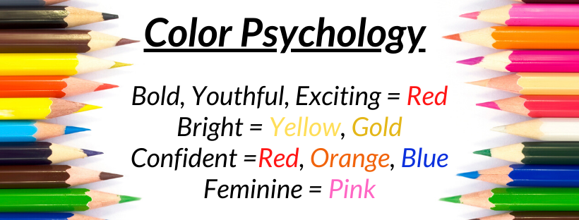
Every colour has a particular impact on the psyche. Each one comes with broad emotional
connotations you can leverage. We’re conditioned to perceive blue very differently than red. If you’ve never thought about these differences or attributes, check out my comprehensive Pick Me Perfect Guide that outlines colour associations and the meanings we attach to each colour. You want to know how your choice is unconsciously affecting your viewer.


Over 50+ ready-made colour schemes are included in the Pick Me Perfect Guide for Free
Always Remember Your Audience
Yes, we need to advertise with understanding, but, like it or not, cultural conditioning does come into play. You need to know the demographic of your target market and how they’re likely to respond to your design. Pink, for example, might not be an ideal choice for a brand that caters primarily to men. Likewise, certain colours have different meanings and relevance across cultures. You want to make sure your selections will be received in a similar way with different groups in different locations.
Try Plenty of Options
Those swatches exist for a reason! You can (and should) mix and match, and pair and experiment with a wide range of options. These colours may stay with you for the life of your brand, and, while it’s not impossible to adjust or adapt down the road, ideally, you want your initial choice to be right the first time. Your audience and customers shouldn’t have to relearn who you are. Take your time.
Look Closely at Saturation and Shading
They may derive from the same base colours, but deep maroon is a very different sensory experience than fire-engine red. Just as you need to think about the emotional difference between individual colours, you should also think about the differences in saturation and shading. As a general rule, heavily saturated colours give you a bolder look that also leans a bit toward imposing or strident. Lighter pastels or diffused gradients lend a softer, more calming aura. Choose wisely.
Play with Context
Even if the logo itself features only one or two colours, you’ll want to see how they interact
against a variety of backgrounds and colour schemes. Think of your website, the ambiance of your store, the colour of your marketing materials, the physical design of your product — all of these will need to complement the colours you choose for your logo.
A Final Word
Of course, companies transform. As time goes on, your business may rebrand and change up its elements. Maybe you’ll emphasize one service over another, break into new markets or change the tone of your advertising. What should stay consistent over the course of your brand’s life are its logo and the predominant colours you choose to signify “This is who we are.”
You will notice that many of the world’s oldest and most famous brands have kept the same colour and graphic design for many years. In the instances when the brand’s logo has undergone new iterations, it almost always originates from the same impulse, and the brand’s updates are simply an evolution of an initial concept.
Your own brand deserves the same level of thoughtfulness and longevity.
About the Author

Hi! I’m Shaneece, brand owner of Savvy Branding & Consulting, LLC, a consulting and design agency based in Maryland. I combine brand design, social media marketing, and encouragement and inspiration to help faith-based entrepreneurs. Specifically, I create graphic design elements, design websites and show entrepreneurs how to market their products and services via social media. Along with being a brand owner, I am a full-time IT professional with a beautiful nine-month-old son and a loving husband.
To keep in touch with Shaneece, check out her website and social media links:


Comments